top of page


INSTITUTIONAL TITLES
WHY ARE TITLES USED?
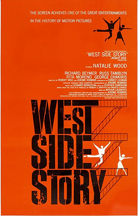
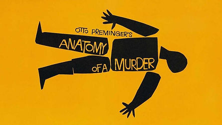
Titles are important to films since they establish the theme and the genre of the movie to the audience. This typography used usually looks similar in trailers and posters to add continuity to this theme. This allows to 'create a climate for the story to unfold' according to American graphic designer Saul Bass

COLOURS


TYPOGRAPHY
Typography is very important in the titles for films as it sets the mood of what the film is going to be about so the audience can instantly link it to the aesthetic of the film. For example 'Moonrise Kingdom' has this cursive light yellow font as it is essentially a love story. This font is typically used in love stories and the light yellow could suggest childhood as the story is about young children love.
In contrast to this you have the title of 'The Good , the Bad and the Ugly' which has a very different typography in bold white letters against a red background. Since this film is a spaghetti western the fonts to said genre suit this title very well since the audience knows exactly that they are going to watch a spaghetti western. Finally I chose the title of 'Psycho' which was also designed by Saul Bass. I really like this title as the words seem to be cut through with a knife as it is one of the most iconic scenes in psycho. The bold yellow also stands out beautifully from the black background which makes it look like it has a sinister feel to it as it is a horror movie.


bottom of page